|
This
is a private project.
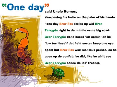
I fell in love with Uncle Remus stories when I was a kid and the
fascination has not let me go. Pictured is page 1 of a 7 page project
that I used to learn some stuff about Macromedia Director. The characters
were drawn by me. I had always felt that B'rer Fox & B'rer Tarrypin
didn't need clothing to do these stories justice. A fox and a turtle
are interesting enough in their own right... |
 |
A
sketch while talking on the phone.
This was to be page 3 of the above mentioned project. B'rer Fox
had to look menacing as seen from the POV of B'rer Tarrypin and
I was having trouble getting it right. I drew this while talking
to Sandra on the phone, proving that sometimes it pays not
paying attention to what you are doing... |
 |
I've
been working at Media
Design Group for 7 years.
We were putting together a proposal for AT&T. I thought this
would make a good mailer to invite people to the conference. We
got the job, but the poor monkey was sent packing (at one point
the sub-theme of the conference was "Get the internet monkey
off your back!". |
 |
Skull
iLAN.
This map made it into a video for the same AT&T conference,
but the name was changed & was covered by a big title. The drawing
was done by myself (later animated in After Effects by Aurora Morgan),
and manipulated in Photoshop to looked aged. The look was inspired
by a little known artist named Owen Wister who illustrated some
of the books I read as a kid. |
 |
Frolicking
zebras.
Another AT&T reject, this was signage that was proposed for
the conference. A swatch of color and a species of animal were to
represent the five different tracks of the conference. I seem to
remember some folks took issue with the animals frolicking in such
a manner . |
 |
Why
is there a tree in the question mark?
One of my favorite designs. The challenge here was to come up with
a graphic that could also have an element that can be used for embroidery
& t-shirts. A more "corporate" look was settled on
& the show turned out to be quite a hit. |
 |
"I
love it! Can we add more stuff to it?"
...and I did.This was an animate for a video for the conference
featured in the preceeding graphic. But part of the "Road to
Victory" involved a trip to Walt Disney World too, so I needed
to add some Disney pictures to this visual. |
 |
"One
that got away..."
It was fun doing a sports oriented graphic. This featured various
sports "balls" blazing past the logo. |
 |
"Look
at the hieroglyphics"
This is another one that got away. This conference was to take place
in Cancun during the Vernal Equinox. The date was VERY IMPORTANT.
I found a site on the internet that had a Mayan calendar date calculator.
I typed in the date & it spit out the hieroglyphics that are
etched onto the wall in the background. |
 |
"Who
would have thought you could have this much fun with the color brown?"
Here is one of those ideas that come to you while you're playing
basketball. In three hours I was done... |